:format(jpeg)/2018/01/tedium011818--1-.gif)
/2018/01/tedium011818--1-.gif)

Dots Vs. Pixels
Two tales of resolution, only one of which involves screens. Do you know your dots per inch from your pixels per inch? Let's break down the difference.
Tonight's GIF comes from an extreme closeup of a computer screen.
Sponsored By … Nobody?
If you find weird or unusual topics like this super-fascinating, the best way to tell us is to give us a nod on Ko-Fi. It helps ensure that we can keep this machine moving, support outside writers, and bring on the tools to support our writing. (Also it’s heartening when someone chips in.)
We accept advertising, too! Check out this page to learn more.
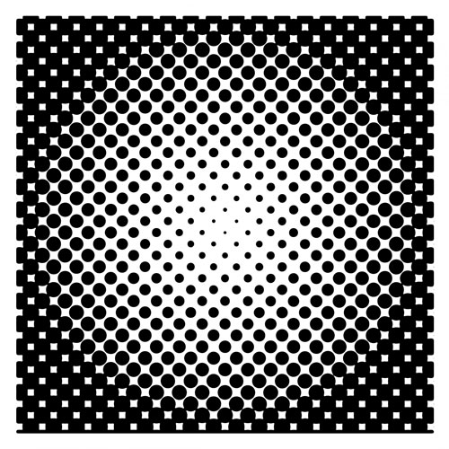
Dots, as shown in a halftone pattern. (Public Domain Pictures)
First up: What’s the difference between DPI and PPI?
Reading this piece might get you a little confused, in part because there’s a lot of similar-ish terminology being thrown around about the way we look at dots and the way they scale.
When it comes to printing via a laser printer, DPI is a key measurement to describe the density of dots that show up on a printed page. The dots don’t necessarily have to be round, and they can overlap, creating a saturation effect of sorts. Pixels, on the other hand, don't overlap at all.
(And before the computer era and even today in the use of offset printing, the terminology used in reference to printing was lines per inch or LPI, which refers to the number of halftone lines, made up of a grid of dots, that fit in an inch of space. Generally, for things like magazines, they'll have a ratio of 2 to 1 for lines versus dots, so a 300dpi magazine will print at around 150lpi.)
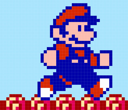
A screenshot of Mario, as shown in the pirated Sonic the Hedgehog mashup Somari. See, the pixels don't overlap!
But the problem is, when you translate those dots to an LCD screen, the terminology changes. That resolution refers to the density of a picture element, or pixel, on a screen. The dots-per-inch resolution of an image can match the pixels-per-inch resolution of a screen, but they’re not referring to the same thing. A dot refers to ink density, effectively; a pixel refers to image density on a screen.
There are a lot of reasons why this can be confusing. One of them has to do with a key difference between the way Windows and Mac OS work.
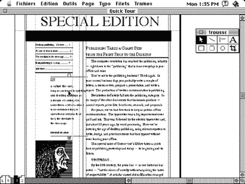
Fans of Aldus Pagemaker appreciated the 72ppi setting on the Mac.
In the early days of computing, Steve Jobs and the rest of the Macintosh team made a decision to set the resolution of its GUI at 72ppi, to roughly match standard point sizes of text and other printed output—which came in handy for desktop publishers, who wanted text sizes to be consistent from screen to printer.
Microsoft, being Microsoft, saw things differently when it was building out Windows, and thought that the increased viewing distance from the screen required a different pixel density. They decided on 96ppi, which meant that text was a little easier to read, but created an imbalance with the ways that other computers worked—in particular, Macs had smaller text, point per point, than Windows computers did.
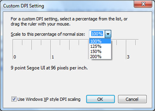
Microsoft eventually let users change the DPI setting themselves.
While rising resolutions have changed this state of affairs over time, it did not calm the confusion around DPI, a term that’s often used incorrectly in reference to pixel density. Adding to this factor is a bit of confusion commonly fostered by Photoshop, which works in dpi, even though you’re really pushing around pixels. Maybe you’ll print though, in which case DPI matters more.
This confusion extends to the web as well, a place where DPI is basically ignored by web browsers.
A 2010 piece on Web Designer Depot notes that web browsers tend to ignore the dot-per-inch setting, at least as far as images are concerned. While JPG and PSD formats support it natively, the digital-focused GIF and PNG formats don’t.
And that means that while you can technically set a photo at 300dpi and upload it to a website, it won’t mean anything until it actually gets printed—though the picture, if it’s high-resolution, will look a lot better than one that isn’t.
Put that photo in a printer at a 72dpi resolution, though, and you’ll get either a postage stamp or something really stretched out. At 300dpi, it’ll be just the right size.
“In general, 300ppi at the original size is considered minimum to reproduce the photograph well at the size of the original. For photographic formats in particular, it is important to carefully analyze the material prior to scanning. Because every generation of photographic copying involves some quality loss, using intermediates, duplicates, or copies inherently implies some decrease in quality and may also be accompanied by other problems (such as improper orientation, low or high contrast, uneven lighting, etc.).”
— A passage from the Federal Agencies Digital Guidelines Initiative’s Technical Guidelines for Digitizing Cultural Heritage Materials, a document that recommends at what sizes and resolutions various objects are scanned in and digitized. In most cases, a 300ppi resolution is recommended, but there are edge cases where higher resolution numbers are suggested based on the level of detail. These recommendations have at times raised concerns among observers who wonder if the 300ppi recommendation is too low—a concern that makes sense considering that there are now smartphones that support resolutions above 300ppi. In a 2013 post on the Library of Congress website, digital projects coordinator Barry Wheeler pointed out that more size added more complexity to the digitization process and could cause problems as storage devices get older. “I believe the costs of higher resolution are vastly underestimated,” he wrote. (Side note: You may also hear the term "samples per inch" thrown out in regards to scanning. In regular use, PPI isn't necessarily wrong, though the printing consultancy IDEAS notes that SPI is technically more accurate terminology in terms of how the scanner samples the image.)
The further you are from something, the lower pixel or dot density you'll need. (Randy Renfro/Flickr)
The closer you are to something, the higher pixel or dot density you’ll need
Despite this confusing state of affairs, pixel density and dot density do often have quite a bit in common.
Let’s go back to the iPhone X we talked about at the beginning of the article. That’s going to be right up in your face most of the time, right? That’s actually fairly useful, because at 458ppi, it allows for much more detail that you’ll be able to appreciate because you’re so close to the screen.
Now, compare that to other things that you look at a lot, mostly in printed form. A newspaper, ten to one, will have a dot count between 150dpi and 200dpi, which isn’t nearly as detailed but is good enough for its use case—printing information quickly on cheap paper.
A high-quality glossy magazine, on the other hand, will likely print at 300dpi, a resolution that captures more quality and will look good close up, but perhaps not to the level of, say, a high-quality photographic print.
(And it should be emphasized again that, for offset printing, LPI may often be the preferred terminology given the situation, though if you're pulling something out of your laser printer, you're generally talking DPI.)
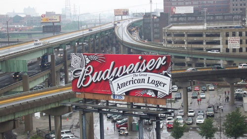
Going the other way, let’s talk about billboards.
Ever look at a billboard up close? Of course you haven’t—quite often, they’re hundreds of feet away, far from your quickly-passing eye. And that means that the necessary printed resolution for those is actually fairly modest.
Clear Channel Advertising says that, for every half-inch square that shows up in the digital files for one of its printed billboards, it’s printed out at one foot square.
At that scale, a 7” x 24” design would fit a 14’ x 48’ billboard. If that 24-inch-wide design is sent to Clear Channel at a 300dpi (dots per inch) scale, that means the design you actually see on the billboard will only show up in the wild as 12.5dpi—not that you will notice, because you’ll be looking at it from a couple hundred feet away.
Digital billboards have slightly different sizes—they’re usually sent to the company at 72dpi, but are also resized to high dimensions.
Interestingly, if you want to promote your company in a bus stop, you need a higher resolution file (1920x1080) than if you’re trying to show up on a billboard (400x1400).
Guess it’s because you might actually get bored enough at the bus stop to look at the pixels.
1975
The year that the Japanese firm Shinshu Seiki Co., Ltd. changed its name to Epson, which stands for “Son of Electronic Printer,” or the EP-101, one of the company’s earliest success stories. It wasn’t the one that made the company a household name, however; that was the MX-80 dot matrix printer, released in 1980. Despite its notably low resolution—it originally couldn’t print graphics at all, but a later iteration of the printer supported resolutions of up to 120dpi—it became one of the most popular printers in the world in the early 1980s.
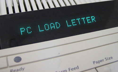
Beyond giving us higher resolutions, HP also gave us PC LOAD LETTER. (Wikimedia Commons)
How printers quickly upped their DPI game in the ’90s
The laser printer was a major step forward for turning text from a computer into something attractive on a sheet of paper.
Printers like the Apple Laserwriter and Hewlett-Packard LaserJet, which applied concepts from xerography and photocopying to things created on the computer, could initially produce black and white pages at a resolution of 300dpi.
Compared to what came before—particularly the typewriter-like daisy wheel printer, first introduced in 1969, and the dot-matrix printer, which first came to life as a teletype tool in the 1920s—it was a dramatic difference.
But it was one that still paled in comparison to what a typesetting machine could do—in the late 1980s, high end phototypesetters and imagesetters could print things at resolutions between 1,200dpi and more than 2,500dpi, according to U-M Computing News.
“As attractive as 300dpi laser printer output may be, it can easily be distinguished from genuine typesetting, and publishers of newspapers, magazines, and books, who need a truly professional appearance, continue to typeset their publications,” author Greg Scott noted.
As a result of that and other issues, printer-makers quickly became engaged in a race to get as many dots onto the page as possible.
In one corner was Hewlett-Packard, which was continually taking steps to improve its LaserJet line, with its LaserJet 4, released in 1994, the first that was able to hit 600 glorious dots per inch. That same year, the company had launched its first color laser printer, which could print two color pages a minute at 300dpi at a cost of $7,295.
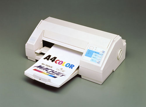
Look at those crisp dots. (Epson press photo)
Meanwhile, HP’s Japanese competitor Epson, which made its name on dot-matrix printers, had started to gain momentum through its use of inkjet technology, launching its first color inkjet printer that year—the Stylus Color Printer, a device that was able to print at 720dpi, using specialized paper that was designed for the purpose. HP had inkjets, too, but theirs didn't print at 720dpi in 1994.
(It helped that inkjets were far less expensive than laser printers at the time.)
“Color printing has finally caught up with color computing,” Los Angeles Times columnist Richard O’Reilly wrote in 1994, who noted there were some imperfections with the high-resolution printing, but found that the result was better than its competition.
Not to be outdone, HP launched a 1,200dpi-capable Color LaserJet in 1996, upping the ante on something that far fewer people would end up legitimately caring about in the long run.
All these innovations, which happened year after year, eventually drove the price down … and created a black market for printer ink.
At a time when you can buy an inkjet printer that legitimately claims to print documents at 9,600dpi for less than $150, and high-quality color laser printers are available for less than a tenth of the price they sold for two decades ago, it’s worth keeping in mind how exciting of a time it was in the late 1990s, when innovations in resolution and print quality were happening seemingly every other year. Now, we take it for granted, but then, it was a big deal to print high-quality stuff from a computer.
However, it should be noted that while printers focused on increasing the DPI density during this era, they largely eschewed lines per inch, and as a result, printers tend to have far lower LPI densities compared to high-quality glossy offset prints.
So how should we compare the two? Well, HP does offer an LPI to DPI comparison on its website for its large-format DesignJet printers, which are commonly used for proofing in offset contexts. If we use that as a baseline for modern printers in general, it means that a 300dpi printer resolution is comparable to an LPI of below 60, while a printer resolution of 1800dpi or higher roughly matches the LPI what you would get from a full-color magazine.
Clearly, these printers weren’t cheap, but they certainly helped make going to Kinko’s a legitimately interesting experience back in the day. (Wait, you’re saying that you’re not excited about printing?)
In case all this chatter about pixels and dots has proven kind of crazy-inducing, let me add one more wrinkle to the mix.
See, one of the most interesting YouTubers I’ve stumbled upon lately is a guy named Alec Watson, who has been producing a straightforward YouTube series titled Technology Connections, which somehow makes the research into the inner workings of vintage electronics fascinating.
Watson has covered a lot of different things, like vinyl, radio, and videotapes, but perhaps where he’s really hit his stride of late is with his recent series of videos on the history of analog television—particularly a great clip explaining how color television came to be.
On the title card, Watson lays out his point in a blunt way—“these are not pixels,” he emphasizes, as he then digs into differing failed color standards, as well as the one that won out.
Watson’s clip describes the not-quite-square pockets of color on these sets as “triads,” in reference to the fact that the blocks, which don’t line up neatly on a grid, are made up of three separate colored phosphors—red, green, and blue—which, when combined by different intensities of electrons pushed through a metal plate called a shadow mask, produce dots of color on the screen.
Generally, television CRT resolution is discussed based on the number of alternating scanlines, rather than dots or pixels. As we moved to computers and eventually digital television, this terminology shifted, but it’s important to keep in mind that pixels weren’t always the way we thought about information displayed on electronic screens.
Sound confusing? Well, let’s add yet another wrinkle: The next time you play an old video game on an old CRT television, consider the fact that the console is generating pixels, but the screen is just displaying beams of light through fast-switching scanlines.
It’s enough to drive you pixel-mad.
Clarification: This piece has been updated to add some context regarding lines per inch, an older terminology that has largely been discarded with for home printing but often finds use in professional printing contexts.
/uploads/ernie_crop.jpg)