the thing with uppercase letters is that if they aren’t there, you start to miss them after a while. they tend to carry a certain weight about them, one that speaks to a certain authority.
(IT’S AN AUTHORITY LOST WHEN EVERY SINGLE LETTER IS UPPERCASE.)
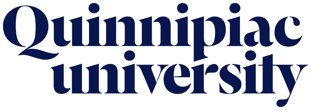
recently, this became an issue for the students of Quinnipiac university, because their school decided to change its logo without uppercasing the u.

angry petitions were filed, and complaints on social media followed. students felt like the university wasn’t appreciating its role as a school of higher education quite enough.
it didn’t matter that the design was put together by one of the greatest branding agencies in the world. these students couldn’t imagine going to a school that would dare to leave a letter lowercase for artistic reasons.
“as a student, it kind of makes us sound like we aren’t smart enough to know that it’s a proper noun,” student marisa viggiano told the local fox affiliate.
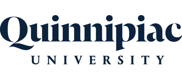
so considering this student outcry, Quinnipiac was left with no choice but to respond. last week, the school decided to replace the all-lowercase use of “university” with an ALL-UPPERCASE VERSION.

“WE DETERMINED THAT OUR SECONDARY AND FULL WORDMARK ‘Quinnipiac UNIVERSITY’ APPEARS SUBSTANTIVELY DIFFERENT FROM OUR PRIMARY WORDMARK BY GIVING TOO MUCH WEIGHT TO THE WORD ‘university’ AT A TIME WHEN OUR GOAL IS TO SHIFT ATTENTION TO THE ‘Quinnipac’ BRANDMARK,” THE UNIVERSITY WROTE IN A STATEMENT.
SOMEWHERE, e.e. cummings IS LOOKING DOWN ON THIS SCHOOL AND SMILING.
:format(jpeg)/2017/02/0223_typography.jpg)
/2017/02/0223_typography.jpg)
/uploads/ernie_crop.jpg)