:format(jpeg)/2017/07/0710_font.jpg)
/2017/07/0710_font.jpg)
But I even though I found a fairly readable one, its body-copy perks were lost on some readers.
A good pal of mine, based in Europe, would send me messages not long after I hit the send button on an issue, saying how much he loved the font and that it was "the best font he's ever seen on a blog." High praise, coming from him.
Not everyone felt the same way. Other folks, often in random forums, often without much of a history of reading the site or newsletter, would complain about it, wondering whether I was trying to punish their eyes for some reason. I wasn't—I promise.
But that said, I don't want to scare folks off from this site simply by using a body face that doesn't jibe with their expectations, so I'm doing a slight update to the typography.
Rather than using various weights of Nexa Slab for just about everything, I'm going to use Nexa, a sans-serif variant from the same foundry, for my body copy. I've done some testing of the font in recent days and I've found it to be a pretty solid font, one that works very similarly in style to my old workhorse and can be dropped in with few headaches.
Nexa Slab, which is still a wonderful font in my view, isn't going anywhere. It's just going to work in tandem with a new pal.
So it's nice—it helps balance out the readability issues some might have had with the typography, while maintaining a semblance of the original look. Win-win, right?
I have to admit, when I made the decision, I was worried how my pal would take it. So I took two screenshots of the same block of text, one in the old font, and another in the new one:
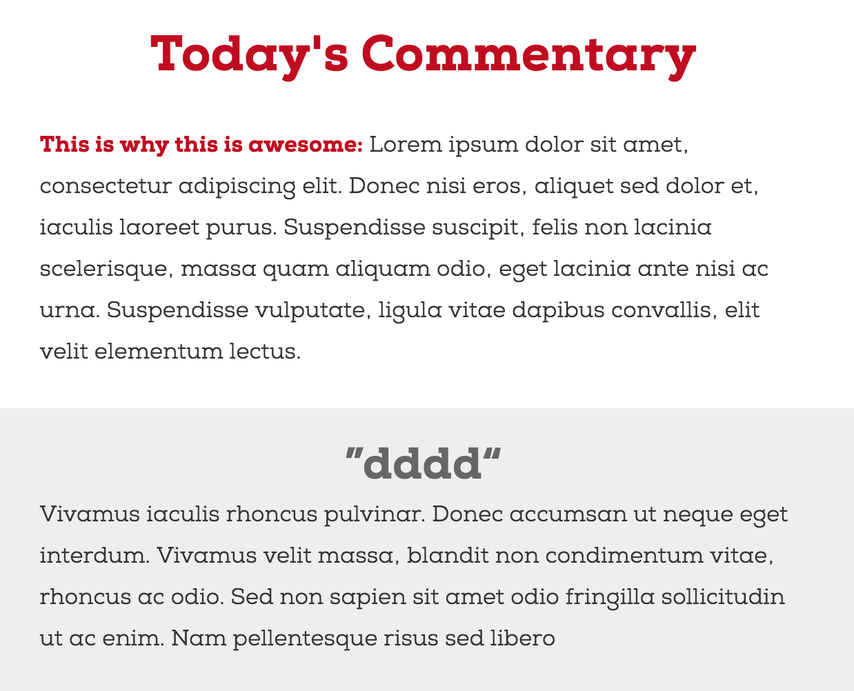
Nexa Slab body copy sample
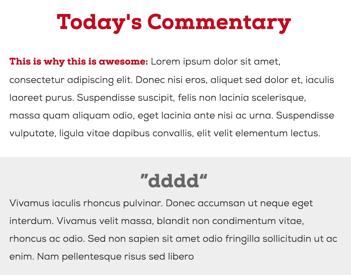
Nexa body copy sample
His response really said it all: "Ahhhh. New version actually better." So, that's one endorsement.
Anyway, it's already up on the website (if it's not showing, clear your cache), and will be in issues of the newsletter soon, as part of a bigger change I'm planning on that front. (Yes, we use snazzy fonts on the newsletter! They only show up in some clients, however, like Apple Mail and Thunderbird. Maybe Gmail will support 'em someday.)
Hopefully you guys won't hate me for doing this.
/uploads/ernie_crop.jpg)