Forget Rand Paul, Let's Talk Paul Rand
Paul Rand, the graphic designer, has a Rand Paul problem: The headline-chewing politician is hiding the famed designer's legacy on Google. Here's why.
(Editor's note: Since this published more than a year ago, Google appears to have fixed the problem. We're keeping this up for posterity, but thanks, SEO Gods.)
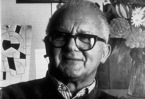
Who the heck was Paul Rand, anyway?
Paul Rand was a corporate logo designer. But he wasn't just any corporate logo designer—he essentially did more to modernize the form than any one person. His designs are iconic, and many of them are still in use to this day—some, admittedly, in slightly updated forms.
Among the ones you probably recognize:

The UPS Logo Rand designed in 1961 became perhaps the company's most famous, simplifying a complex shield that appeared to say "Lips" and creating a symbol that elegantly symbolized the company's focus, shipping packages. The only reason they got rid of it, in fact, is that by 2003, the company's focus had expanded to general logistics. "Quite simply, the bow-tied package restrained UPS's ability to represent these new services," the company emphasized.
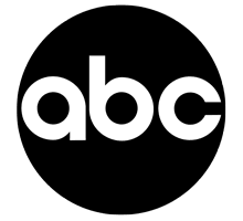
ABC's black circle. While Fox and NBC have each redesigned their logos numerous times over the years (including this particularly unfortunate outing from NBC in the late 1970s), Paul Rand's take on the ABC logo has largely stood the test of time, ensuring that everything before his logo faded into history. The network eventually added 3D shaping to the logo, but it still maintains the simplicity of Paul Rand's black circle. (Also worth discussing in this context: CBS' eye, which has been around since 1951.)
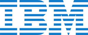
IBM's best-known logo by Rand, was actually its second. Its first, a set of blocky slab-serif letters, eventually went the way of the dodo, but the company stuck with Paul Rand—who eventually gave the logo some new life with a few stripes. "Rand’s series of IBM logos culminated in a 1972 version formed from stacked stripes, suggesting speed and dynamism, which made the company’s initials instantly recognizable worldwide. The '8-bar' logo is still in use today,"according to the company.

Westinghouse's longtime logo, which remains in use today, is remembered by many for the circuit-styled "W," but what many miss about the logo is the way that the "st" links together into a single piece. It's a subtle but effective touch.

The Enron logo, which may have been a great logo, but it was completely overshadowed by a company run by a bunch of jerks.
It's worth noting that Paul Rand did not simply design logos. He did a lot more than that—he designed brand languages for each of these companies, brand languages so complete that they didn't need to change anything up for decades.
"Design is the method of putting form and content together," Paul Rand said in a November 1996 interview, less than two weeks before he died. "Design, just as art, has multiple definitions, there is no single definition. Design can be art. Design can be aesthetics. Design is so simple, that’s why it is so complicated."
Paul Rand is essentially the designer that every modern designer wants to be. When you see logos that are simple, free of excessive gradients, and can explain complex things without a lot of trouble, it's because folks like him and Saul Bass set the stage for this.
$100k
Would Paul Rand like Rand Paul's logo?
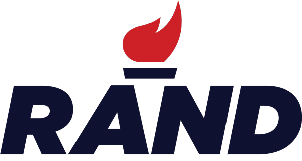
That's a good question. Rand Paul's logo, with the italic type and the flame it uses, certainly offers a clever usage of trapped white space, turning that space into a torch. Now, to preface this—there's no evidence Paul Rand has ever worked on a political campaign, and Rand Paul was still knee-deep in ophthalmology when the graphic design legend died in 1996. There's no evidence the two men ever knew one another.
Nonetheless, being a designer, he probably would've had an opinion on the logo. Not pretending to be him here, but we bet Paul Rand might spot a few problems right away:

The logo is hard to read at a distance. If you're walking down the street and see a logo the size of a stamp (say, about the size shown above), a block and a half away, you may have to squint to get the message that it's trying to get across. Political signs are read this way all the time, remember.

The torch imagery is too subtle. This is not the FedEx logo we're talking about here, where the subtle arrow won't take away from the overall logo. The torch is a key element of the design, and most people will miss it until someone tells them that Rand Paul's torch has a handle.
It's not unique enough. As pointed out by the existence of this very rant, "Rand" is a short word that means different things to different people. Barack Obama got lucky in this sense, because there aren't many Obamas out there, meaning his logo could be a clean slate. Rand Paul, however, shares his name with things both favorable to his message (Ayn Rand, an author who Rand Paul is not named after) and that could confuse it (Rand Corporation, a nonprofit think tank that Rand Paul has no affiliation with).
"Are we talking about Rand the candidate or Rand the corporation? Unfortunately, there is no way of knowing because the generic torch applies equally to either entity," famous graphic designer Milton Glaser, who designed the "I ♥ NY" logo, told Business Insider. Most assuredly, Paul Rand would agree here—as Glaser is arguably the modern-day bearer of Paul Rand's torch.
One other thing that might give Paul Rand pause is Rand Paul's decision to democratize the logo—he literally tweeted the EPS file to his fans last week and told them, "this is your campaign." Paul Rand was certainly a fan of playfulness, but he may have been worried about the way that he was essentially giving up his message to the world.
It makes sense why the presidential candidate did it: Obama had much success from logo mutations in his 2008 campaign. But you gotta wonder if he's just gonna get a bunch of crap.
"Most corporations think the logo is a kind of rabbit's foot or talisman—although sometimes it can be an albatross—and believe that if it is altered, something terrible will happen."
— Paul Rand, discussing the challenges many corporations face when dealing with their logos, which are often treated as things that can never be changed. Rand, famously, flipped this philosophy on his head with a graphic he created for IBM that featured an eye, a bee, and the letter M.
Google does a lot of stuff online. Though it wasn't obvious at first—that logo of theirs is no spring chicken—Google cares about design. It cares about the people who design things.
So why are they giving Paul Rand the shaft? This is not a "Santorum"-style situation here—nobody's gaming anything here.
This is a situation where someone who has had more influence on millions more lives than Rand Paul ever might is getting treated like a second-class citizen due to an algorithm. Microsoft's Bing does the design legend even worse—only two of the top ten results for Paul Rand are about the designer.
Worst of all, Apple's Siri, when asked directly who Paul Rand was, brought up his political nemesis. What the hell, Apple? Paul Rand was like Steve Jobs' favorite person, and you guys even put him in your "Think Different" campaign. Why has Siri forgotten this?
Google, Microsoft, Apple: Do the right thing. Make sure when people search for Paul Rand, they're not getting bombarded by a completely different person. Correct your results if they show Rand Paul at all. It's doing a design legend a disservice.
:format(jpeg)/2018/04/gguzomr2chs1j6rcwuvj--1-.gif)
/2018/04/gguzomr2chs1j6rcwuvj--1-.gif)

/uploads/ernie_crop.jpg)