:format(jpeg)/2017/04/tedium041817.gif)
/2017/04/tedium041817.gif)

CMYK All The Way
How mass-production printing technology, starting with the lithograph, was pushed forward thanks to a growing interest in color.
Editor's note: Tonight's GIF is a bit of deconstruction of a nice piece by the excellent GIF artist Bees & Bombs. Nothing like breaking the rules and adding a little bit of color sometimes.
“We didn't run a photo, where I think every other paper in the world, including the international edition of the Journal, ran a photo.”
— Jessica Yu, the senior visual editor of the Wall Street Journal, explaining to The Atlantic how the newspaper’s longtime aversion to color caught it in a tough position on September 12, 2001. The paper didn’t have a single photo on the front page—and not a single picture at all of the 21st century’s most important news story until page A6. There were a few color pages in the A Section that day, but they were all paid ads. The next year, the newspaper introduced a bold redesign that added the missing color, along with more photography, which is now an integral part of the paper.
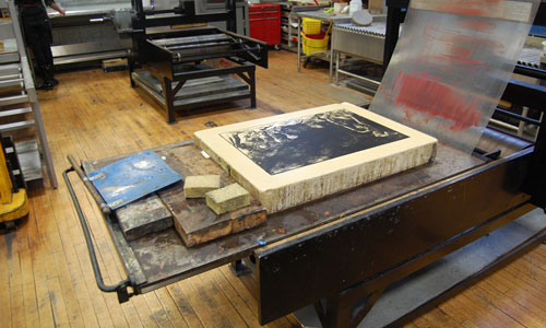
An example of lithography in process, featuring the all-important stone. (jrsquee/Flickr)
How lithography gave us beautiful, easy-to-repeat color and eventually made mass-production color printing possible
When German playwright Alois Senefelder, frustrated by the high costs associated with printing his play in the late 18th century, started experimenting with a greasy writing substance, a wet piece of limestone, and an oil-based ink, he found more than just a cheap way to print his books.
He created lithography—a technology that ultimately helped push forth the Gutenberg press into the modern era by using the chemical properties of oil and water to create the first flat-surface printing press.
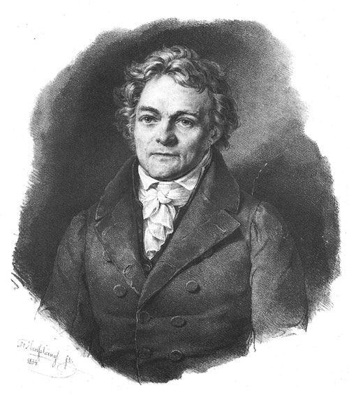
A lithographic print of Alois Senefelder, because why not? (Wikimedia Commons)
The process wasn’t good for printing a newspaper at the time—it was slightly more complicated than the traditional printing process allowed for—but it proved very effective for artists, who finally had a medium that made it possible for them to draw flat objects without and make numerous copies that were just as attractive as the originals.
Of course, it was a process begging to be improved with the addition of color. Senefelder (and many other tinkerers) started thinking in this direction, but it was ultimately France’s Godefroy Engelmann who received a patent for the technique, called chromolithography. In 1816, Engelmann and a colleague, Charles-Philibert de Lasteyrie, came up with a two-color lithography process that relied on multiple stones. Engelmann and others kept improving it, and at the time he received a patent for it in 1837, the process was effective, even if it was complicated. The results of Engelmann’s three-color and four-color prints were just too realistic-looking to ignore. (Engelmann, alas, died just two years after his patent was locked into place.)
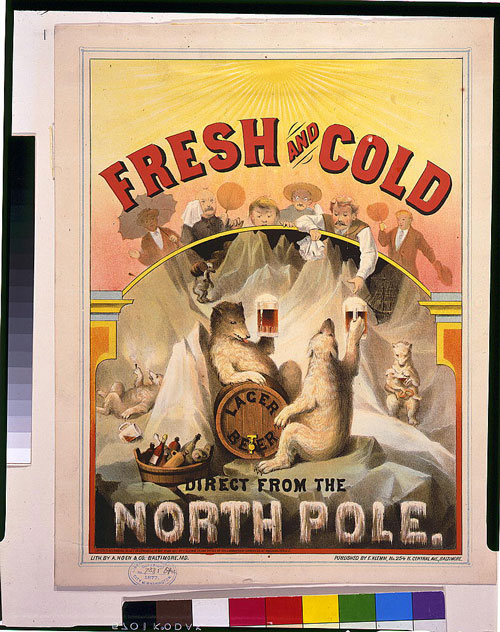
An example of a lithographic work from A. Hoen & Co. (Library of Congress)
Soon enough, the technique found success globally, in large part because of the way that it democratized art, making it inexpensive enough to put into homes and to use for advertising and product packaging. In the United States, for example, German immigrant August Hoen had made a name for himself and his company, A. Hoen & Co., with its multi-color prints, which were often closely associated with tobacco labels and early poster-style ads.
Hoen added his own innovations to the mix, including the invention of the lithocaustic process, which adds a layer of acid to the mix, allowing lithographic printers to see exactly how the shading is affecting a specific layer of the lithographic stone.
In his initial patent for the lithocaustic technique, Hoen explained that, before he came up with his technique, it was basically impossible for lithographic printers to know how the shading would look until the end of the process—in other words, there was no “print preview.” From the patent:
The most serious defect of this process is found in the fact that the artist can never know with certainty the depth of the lines, and he can only guess it by the strength of the acid, by the time it remains on the stone, and by the nature and chemical composition of the stone itself. Another difficulty is caused by the continual stopping out of the finished parts, which completely prevents the artist from seeing the progress of his picture. His memory is his only guide, and this is very apt to confuse and mislead him. Furthermore, the gradation from one tint to the other will always be more or less visible, showing by decided marks the previous covering with ink. All these difficulties are avoided by the use of my composition for producing the picture.
From there, the lithography process inspired pretty much every mass-printing technology that came next. Stone gave way to metal plates; lithography concepts are often used in tandem with with the modern conventions of offset printing. And things became even more sophisticated as the concepts of lithography were combined with those of photography, creating a process that’s called (wait for it) photolithography.
As the processes improved, they often became faster, more sophisticated, and easier to use—meaning that printing technologies that would have once been ignored by publishing outlets, like newspapers and magazines, became downright common. (And if you really want to stretch it, there’s probably a case to be made that compact discs and microprocessors, which both rely on the transfer of information from one surface to another, also share a lineage with lithography.)
Just don’t expect to run into any lithographic stones at the print shop. For one thing, we have printers these days; for another, those have fallen largely into the domain of artists, who have kept their use alive globally. This YouTube clip, featuring University of Houston Artist in Residence Charles Criner, makes the case for modern lithography.
When it comes down to it, there are a lot of advantages that lithography has for artists whose primary medium is a sheet of paper—no matter how many colors inevitably end up on the final result.
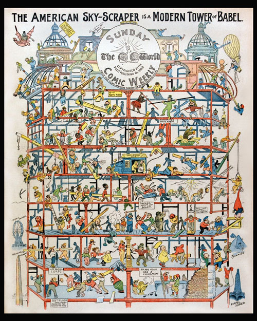
The New York World's Sunday Comic Weekly, circa 1898. (via Duke University's early comic strips collection)
Five notable moments in the history of printing in color—before we had computers
- In 1843, botanist Anna Atkins published the first book consisting of nothing but photographs when she published Photographs of British Algae: Cyanotype Impressions, a book that took advantage of the photographic properties of contact printing to capture the details of British seaweed on a printed page. The result, though in a strongly blue hue due to the nature of the contact-printing process, picked up an incredible amount of detail from the original object. Cyanotypes later became better known for their use in “blueprints” of architectural drawings.
- In 1893, illustrator William Kurtz patented the first color-separation technique that uses a combination of three separate plates—cyan, magenta, and yellow—to cover the array of colors. (The technique is subtractive in nature, meaning that when the colors are combined, they block waveforms of light from being seen. Computers, on the other hand, use the colors red, green, and blue, which are considered additive in nature.) The technique was improved in 1906 when the Eagle Printing Ink Company introduced the four-color wet ink process, based around the CMYK color set. (CMYK, by the way, stands for cyan, magenta, yellow, and “key”—also known as black.)
- In 1894, Joseph Pulitzer acquired a color printing press for The New York World, allowing his first-of-its-kind comics page, The World's Funny Side, to run as a full supplement on Sundays, complete with elaborately colored illustrations. Pulitzer’s highly visual look bled into the rest of the newspaper (mostly in its Sunday editions), but the paper’s graphical, illustrative approach did not catch on with the broader newspaper industry for nearly a century afterwards.
- In the 1930s, the advertising industry, which had avoided color out of concern that the reproduction wasn’t good enough compared to the consistent tone of black and white photography, finally gave in to color, as photography quality and reproduction improved, according to Harvard University curator Melissa Banta.
- In 1962, Pantone employee Lawrence Herbert bought the company, and changed its direction immediately, moving it toward creating a language around specific colors, making them easier to track. This move allowed Pantone to define the color printing industry for decades afterwards.
1978
The year that National Geographic magazine moved away from four-color letterpress printing for its magazine—a somewhat shocking revelation, considering that most of the magazine industry had long moved away from the technology by that point, which was somewhat imperfect for photography. The reason the magazine stuck with it so long, according to American Printing History Association presenter Philip Zimmermann, was that newer technologies, like web offset printing, could not handle the massive scale of the magazine’s circulation, which had topped 8 million by the 1970s. Eventually, the magazine moved to rotogravure printing, a highly specialized roller format that is generally only used at high scales.
August Hoen, in his own quiet way, probably did more to bring color to the world than any other American. He didn’t just use the chromolithographic technique—he kept improving on it, to the point where it became incredibly sophisticated.
Now, the building where his company did so much of that work, actively from 1902 to 1981, is getting a revamp that works much in the spirit of innovation.
The 80,000-square-foot Hoen & Co. building is being converted from a dormant manufacturing facility to a large multifunction space, with the goal of revamping the local neighborhood in East Baltimore. The facility will include a workforce training center, a bookstore, a writers’ workshop, a coffee shop, and even a farmers’ market. Additionally, the company is renovating a number of nearby homes, with the goal of making those livable for those with low or moderate incomes.
It’s a major endeavor—a $22 million one, according to the Baltimore Business Journal—but the developers see the effort bringing back a little of Baltimore’s color.
“When Hoen is underway, we're going to see the whole community shift,” project executive Larry I. Rosenberg told the Business Journal.
We may be in an era when smartphones dole out more colorful images than sheets of paper, but in a quiet way, Hoen’s colorful legacy will live on in the neighborhood that used to call his company home.
/uploads/ernie_crop.jpg)