Today in Tedium: I have a bone to pick with one of the best-known news outlets on the internet, and pick it I shall. Since 2017, Politico cofounders Jim VandeHei and Mike Allen, along with a cast of notables, have taken a brevity-driven approach to writing about the news of the day, no matter what form it takes, on a site called Axios. Much of the content is written in bullet points that are designed to focus points of communication. The company has branded this approach as something called “Smart Brevity.” Now, it would be one thing to write everything in a quick hit format, but they’ve gone further than that, attempting to sell the communication approach to businesses and even writing a book about it, as if VandeHei is friggin’ running IBM over here. As someone who once ran a popular website that specialized in brevity, I first watched this state of affairs with a sense of cynicism, then bemusement. I have written Twitter threads to remind people that, hey, they weren’t first. I can’t help but think about, given all the tools they have, how little they do with brevity! Today’s Tedium is questioning whether alternative story form journalism has a place on the internet besides bullet points. — Ernie @ Tedium
“Yes, deep in the childish recesses of our brains, we all share the same throbbing dread of text. It’s like math anxiety: Text anxiety. In small doses, text is tolerable. But when we’re wading through deep heaps of it, we hate it. Even worse, we hate writing it. And yet we all need to communicate, to share information, to express ideas.”
— Tim Harrower, a visual journalist, Society for News Design lifetime achievement award recipient, and the author of a popular journalism textbook, The Newspaper Designer’s Handbook, discussing the concept of writing for non-readers, which is at the heart of alt-story-form journalism. This is a conversation that has literally been happening in the world of journalism for at least a quarter century, probably longer, and if anything, the pendulum has swung away from short in favor of long.
A Few Useful Definitions To Get Started
charticle
A name for an article that is only made up of visuals. A concept that first came into use starting in the 1970s and 1980s in newspapers, it came to define the way that print newspaper delivered information to their readers, as it was an effective method to tell a story made of complex parts in a relatively simple way. A key element of an approach like this is that the copy is edited very tightly. Some famous charticles include New York’s “Approval Matrix,” USA Today‘s Snapshots, and the inventive visuals of Spy Magazine.
listicle
A type of alternative story form that is popular on the modern internet—to the point that it has an entry in the Merriam-Webster dictionary. Generally, this type of setup is augmented with a lot of visuals, and can appear as a slideshow, another type of internet-native alt-story form.
infographic
A type of alternative story form common in both print and digital settings. In print, these kinds of visuals are often highly detailed, often using elements like maps, graphs, or 3D graphics to tell a story. While digital infographics can do this, more often, they tend to rely on more simplistic storytelling techniques, making them closer in spirit to a charticle than an infographic. Despite this, infographics is the name that has tended to stick online. These are popular as a way to draw traffic, as in their online form, they serve a viral purpose rather than a purely editorial one.
Is this person diving into a long-form newspaper the exception, or the rule? And how does journalism reach them? (No Revisions/Unsplash)
Do people actually want to read less, or more? And what should the story look like?
Ever since I got into journalism—I spent years working in newspapers as a graphic designer, by the way, and I owned Tim Harrower’s book—I have heard this debate about whether people wanted to dive into a 2,000-word story, or if they wanted something that provided most of the information they needed in a couple of hundred words.
When I got started, the short blurbs seemed to be winning, but over the last decade, as newspapers became less about paper, the longer pieces seemed to be making a comeback.
I think an excellent example of this tension in action came upon the launch of Vox in 2014. One of the key things it attempted to do was present content in a series of “card stacks” that explained information in a short, quick-hit style. But despite being a key element of the site’s creation, and arguably far more innovative than “Smart Brevity,” card stacks eventually got shelved in favor of more traditional storytelling, despite having driven much of the ideation around the site.
“I’m still proud of them and we still use them, but they’re not going to change the whole game. I think that’s clear,” Ezra Klein said of the idea in a 2016 podcast.
It’s too bad, because honestly, we could use something like them in modern journalism. But the inertia against that specific form is high.
In many ways, the move away from short reflects a shift in the medium of the page, rather than the needs of the reader. After all, the longer the content is, the more likely you’ll engage with it, right?
In some ways, this is the opposite of how it should really work. If the goal is reading comprehension, rather than engagement, we have to build for high information density, so that readers can get the most out of the content in the least amount of time. In an era when the literal newsprint was shrinking, this was the direction newspapers were largely moving towards before the pesky internet got in the way.
Unfortunately, this isn’t necessarily how it’s played out on the modern internet—where long content has become the more favored medium for consuming information, and there are no constraints as to how big or small the page should be.

Does Axios approach adding bullet points like it’s building out a shopping list? Or do they just write the story, then slap them on the page? (Torbjørn Helgesen/Unsplash)
I would argue that a big reason we’ve mostly moved from short content has to do with business realities, rather than the needs of the reader. And to me, I think that’s a big reason something like “Smart Brevity” exists. It is a way to play with the format of content without necessarily breaking the convention of a format that advertisers favor and readers are used to.
The problem is, a lot of Axios’ bullet points tend not to carry any rhyme or reason. For example, this piece published just this morning seems to start with a firm structure of “Why it matters” and “What’s happpening,” but about halfway in, the bolding and bullet structure falls apart, failing to maintain an internal logic. To me, a lot of Axios pieces read like that, where the bullet points seem to be in there to hit a bullet point quota or something. In many ways, I think Axios would do itself a favor if it mandated strict rules as to how to bold and how to bullet.
Other outlets, in my opinion, do this a lot better. Morning Brew, for example, uses a lot of bullets and bolding, too, but it does so in a way that actually seems to follow a logical shape.
I think we know that readers don’t get past headlines; I think the secret to solving this is not just bullets. We need to encourage new editorial shapes that break down data more efficiently. Unfortunately, I don’t think the ad department is going to love that.
Is there room to grab readers with data points that go beyond the headline? The answer in the internet age, at least thus far, appears to be no. (pixel6propix/Unsplash)
Five reasons traditional alt-story-forms don’t work great for the internet
- The dullness of SEO. Search engines require a minimum word count for everything (generally around 300 words), and generally favor longer, more in-depth pieces and tends to actively ignore design. To put it another way, the deck is stacked against short-form content. (With ShortFormBlog, I learned this the hard way.)
- The complexities of mobile. In the early 2000s, you could generally design around a handful of screen sizes and hit most people. But today, all bets are off, as information has to be delivered in a variety of formats, many of which didn’t exist a few years prior.
- The commoditization of social media. Unlike a magazine, where the styles are generally owned and maintained by the publisher, most social networks are shaped by the formats that users are given. While there is plenty of room for creativity with social formats like Twitter threads or Instagram Stories, they ultimately shape how we consume information, making it more desirable to stick with the network’s predefined norms. (In some ways, one would argue that the limited static palette pushed people towards video, where there is more creativity.)
- Accessibility concerns. Webpages have to work for just about everyone, and while there is certainly room to get creative with web design, it can threaten to leave some end users out of the loop if care is not taken. Accessibility is important, but it adds a complicating factor when it comes to digital design that was mostly not a concern with print. This is a problem I had with ShortFormBlog—some users wanted more descriptive text, but Tumblr at the time didn’t offer a way to support alt text, which meant that to support it, I would have to break the model for my site.
- Design conventions. Simply put, nontraditional designs are harder to sell on the modern internet, which means that many of the more ambitious layouts for alternative story forms in print don’t easily translate to the web without messing with user expectations. In some ways, it reflects that the web is actually in some ways a less flexible and more complex platform than print.
30,000
The number of first-edition magazines that University of Mississippi faculty member Samir Husni, known as Mr. Magazine within the publishing industry for his encyclopedic knowledge of the sector, is said to own in his collection. Husni, who is known as something of a contrarian thinker in the magazine space, having once made a call that Maxim would be a major hit despite the fact that many other critics in the sector believed that take was wrong. He was right.
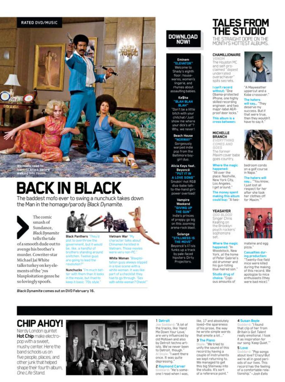
A layout from the inside page of a 2010 issue of Maxim. You laugh or ignored it because of its photos, but Maxim was actually an extremely innovative publication in terms of how it organized information on the page. The challenge I see: Can we replicate this kind of approach online, without the risqué nature of the magazine itself?
What created the alt-story-form boom in print in the first place?
The layouts that Tim Harrower features in his quarter-century-old textbook are significantly more creative and interesting than anything that most modern websites are doing, where the path to least resistance has won out.
I’d like to make the case that a big reason that this happened was because of technical flexibility.
See, in the decades before computers, news pages were often laid out through paste-ups, hand-driven layouts that allowed some flexibility, but were often tedious to manage and standardize. (They also, as the name implied, required a ton of rubber cement.)
But starting in the late 1980s, computerized design programs became more common. In some ways, desktop publishing tools created a paintbox effect, in that it was way easier to break the rules of the format and stretch the capabilities of the form, leading to more experimentation, as well as flexibility to experiment, on a daily basis.
But the web had sort of the opposite effect. As websites had primitive roots where graphic design was a challenge and even an outright tension, it meant that convention mattered more in digital than it did in print. Also, the limited nature of the design tools, even with occasional shining lights such as Flash, meant that it was often easier to go with the status quo than to change things. (I think it’s also important to point out: With print, the publisher has control of the page where the layout ends up. With digital, the user does. That is a significant difference that I think has impacted how we approach design in the digital age.)
I guess it raises the question: If design tools became more flexible in digital contexts, where new ideas could be sketched out in a matter of minutes at an agility as fast as or faster than paste-ups or print layout, would it encourage new types of innovation in journalism?
Could we do more with short-form visual design than just throw a bunch of bullet points into the mix? Can the Maxim approach work on the internet?
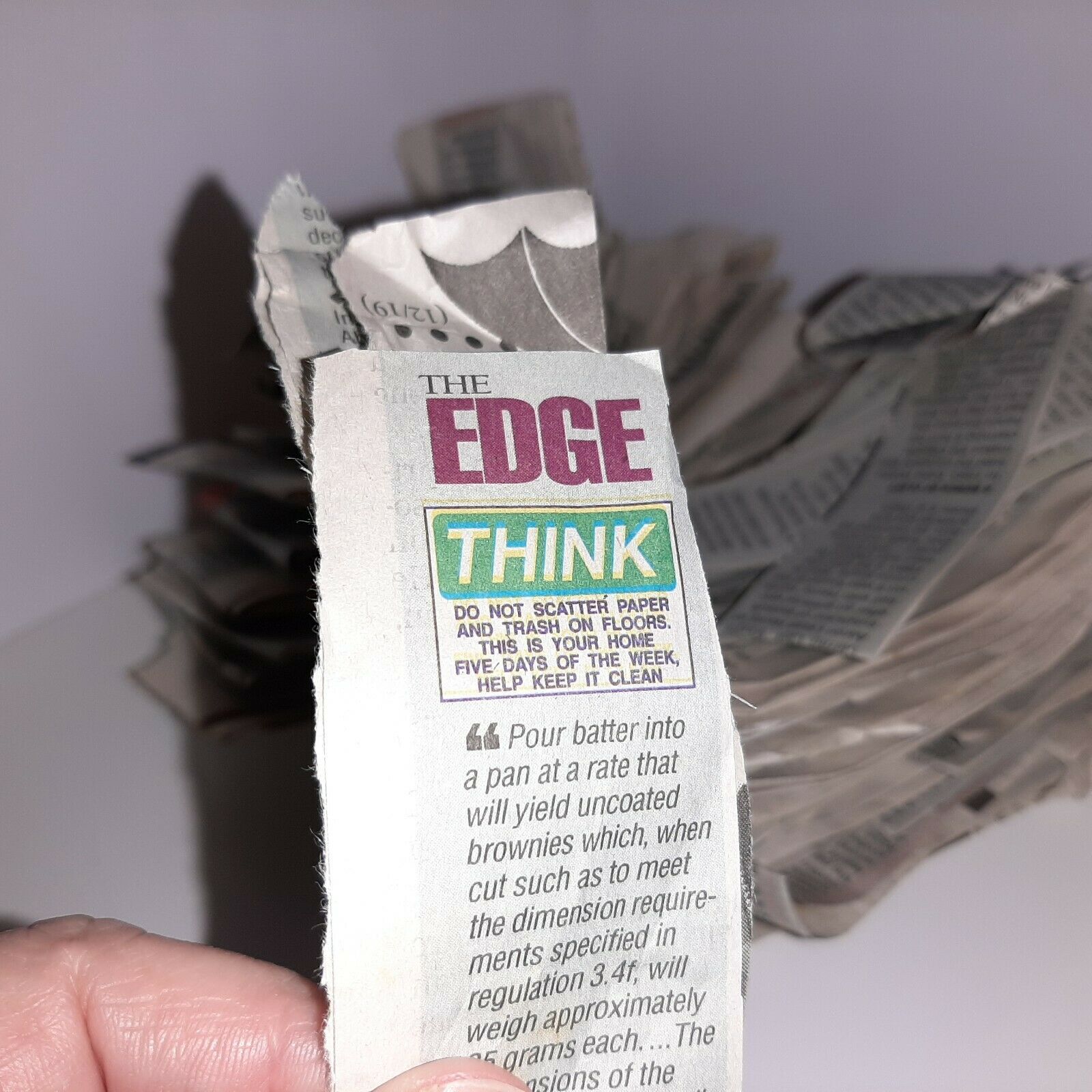
The Edge was such a popular column that someone actually saved numerous copies of it and is selling those copies on eBay. Mind you, Tim Harrower did this like a quarter-century ago so the seller was holding onto The Edge for a long time.
A Lesson From Newspapers
Tim Harrower, the guy I mentioned above, didn’t just make design textbooks for a living; he was also a longtime news designer for The Oregonian. One of the things he developed during his time at the paper was a six-days-a-week half-column for the newspaper called “The Edge,” where he forced himself to create new content every single day in a minimalist spot. While he only did it for three years, it was a hugely popular and influential feature as it used the medium in an interactive and thoughtful way, because it maximized the use of the page.
In some ways, Axios’ approach benefits from the fact that, while a computer screen is significantly more flexible than a page, the content has to live in many more places and handle more settings. In many ways, it discourages a more graphical approach because we can’t necessarily quantify the nature of the content in quite the same way.
Newspapers and magazines simply could play with the shape a lot more than we can in a digital format, where a lot of things are predicated by business needs. The content loses its power as soon as it gets put into the CMS—and attempts to put the genie back in the bottle, using approaches like iPad magazines, just proved to be bad fits for how people actually consume content.
Instead, if we live in a world where every article must have its own URL and data structure, that means that you can’t do things like randomly blow up the page and switch up conventions every once in a while. To me, if we could figure out that balance would be a real innovation in smart brevity.
But instead, journalism has to lean on the writing style alone. And honestly, Axios is far from the first innovator in its own D.C.-leaning sector in which it works: Industry Dive, which competes in the same niche industry realm as much of Axios’ coverage does, has been using a bulleted approach for years. Smartbrief, a company that produces newsletters for various industry sectors, has been keeping it short since at least the year 2000.
As a designer, I just find it strange that one company has managed to sell so many people on the concept of short, quick-hit content without really doing anything to shift the form.
Because if a news outlet did do that, it would be one hell of a fascinating read.
--
Apologies to Axios. Find this one an interesting read? Share it with a pal!
And thanks again to the music newsletter Ecléctico for sponsoring. Be sure to subscribe!